Day 6
Game Art
Hello again. Today we make art!
What types of art do we need? Well, let’s see…
1.
Objects
2.
User Interface
3.
Background
Game Art Theory
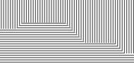
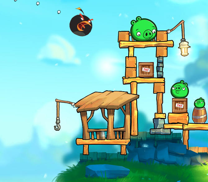
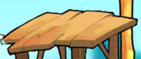
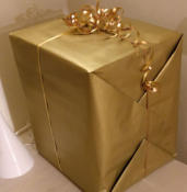
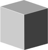
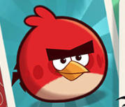
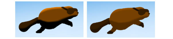
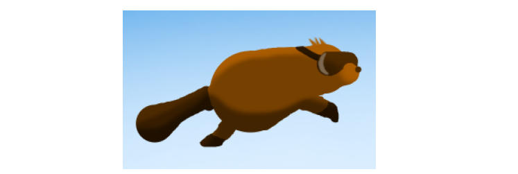
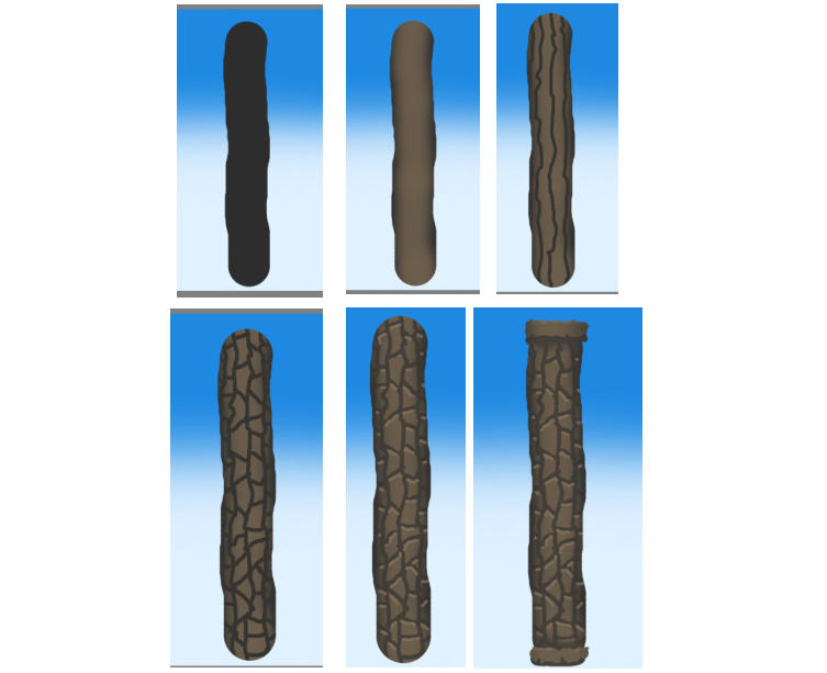
Game art needs to fill some boxes because game art has a function. It’s not typically something you can just dive into and ponder what sort of meaning it conveys (although there are exceptions). The first and foremost function of game art is to assist the player. • If the player dies because he/she didn’t know you couldn’t touch something, that’s on art. • If the player dies because he/she thought the box looked like you could stand on it, that’s on art. • If the player gets frustrated because she/he can’t figure out that the thing on the wall is a teleporter that takes you to the next level, that’s on art. Many of these complaints are these days addressed by tutorials. But tutorials kill the pacing. Would you rather have your players just intuitively know what they can and cannot do? When you are making art for your game, references are essential. Professional artists always use references. They dig out pictures that give them clues as to how the piece they are making should look like. So, let’s start this lesson by looking at a game that I consider to have great art and that is similar in style to what I’m trying to accomplish with my Beaver Mark I. (This is from Angry Birds 2, © Rovio Entertainment Corporation.) The most important point I’m trying to make with this picture is that great game art knows how to use contrast to its advantage. And contrast isn’t just making the darks darker and the whites whiter. It’s about a lot of subtle things. If you look at the picture on the right, there is barely any contrast in it, which would make playing a game like this really difficult. These four examples on the other hand use contrast in different ways to make the foreground pop out of the background. The first one uses complementary colors that are at the opposite ends of the color spectrum. The second one uses dark and light values to create contrast. The third one utilizes different patterns. And the fourth one uses saturation, i.e. the background color is duller than the rich purple of the foreground. How many of these techniques can you spot in the Angry Birds image? 1. The background is almost white, while the foreground is darker. 2. The interactable objects (pigs, boxes, timber) are all outlined, which creates contrast between the objects and the background. 3. The interactable objects are more saturated than the grass and stone floor, that is duller and doesn’t have any outline. 4. The ground and sky utilize a colder palette (blue and green) while the objects have warmer colors (orange, yellow, red). 5. The player character is a dark blob in a world of generally bright objects. 6. The characters are very round whereas the constructions are more rectangular. 7. The characters are very plain, one color while the surrounding objects are textured. All of this allows you to recognize all the important elements in the scene in probably less than a second. Another very important subject is light and shadow. In real world all sides of an object have a different light value. Whatever side is facing a light source has the brightest value. And the further away from the light source a side is turned, the less bright it is. There are three objects above. The first is a cube that I made out of three shapes. The second one is a photograph of a present. The third one is a platform from Angry Birds 2. All of these are very simple representations of a three-dimensional object. They have brighter sides and darker sides. One noteworthy thing is that if you have sharp edges pointed towards a light, these are typically the brightest parts of the object. This is true, to a degree, with all the examples above. The same rules apply to everything solid, whether it’s a coin, a car, or a face. Not all lighting has to be completely realistic. If you look at this character art, the light and the shadow on the body and the beak don’t behave realistically. But they do a good enough job to make the character appear more three-dimensional. Also, in real world the light and shadow would rotate as the character rotates. But because the shadowy part is painted on the picture, rotating the character 180 degrees makes the shadow face the sun. This is fine.More Software
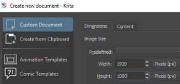
If we want to make art ourselves, we need a good tool for the job. My suggestion is Krita. It’s a free painting application with a ton of features. (If you’re more familiar with GIMP, you can use that as well. If you own Photoshop, that’s even better.) Get Krita here for free. Once you’ve got the program installed, open it up and create a new image by clicking the empty space in the middle. Select Custom Document and set the Width to 1920 and Height to 1080. I like creating the whole game screen in one document. This helps me to see if everything matches together.Background
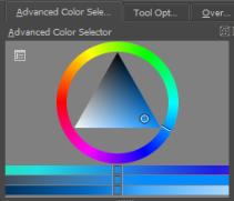
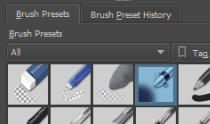
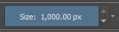
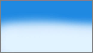
Let’s start with the background. Select the Fill Tool and some bright blue color. Then, click the image with the tool. This fills it with blue. Next, select the brush tool and go for something closer to white. Go to the Brush Presets and select the Airbrush_Soft. Then, make the set the brush size to 1,000 px at the top of the screen by dragging the bar all the way right. After that, paint some white on the bottom half of the canvas by dragging the mouse around. Why the bottom half? Because if you look at some reference photos of skies, the bottom is generally brighter than the top. You can enhance the image further, but I think there’s power in simplicity, so I’ll just move on to other assets. Save this image by selecting Save As in the File menu. Set the File type to PNG image. When Krita asks you about the Compression, you can set it to 1. This will increase the file size a bit, but it’s not a big deal.The Character
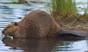
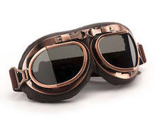
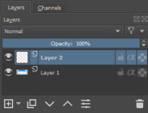
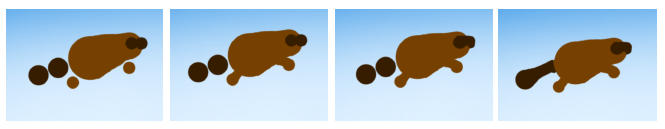
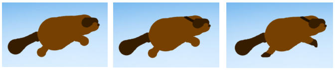
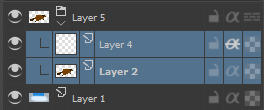
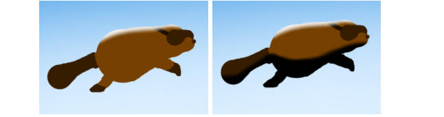
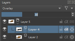
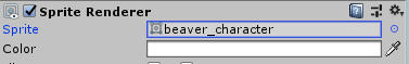
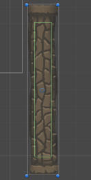
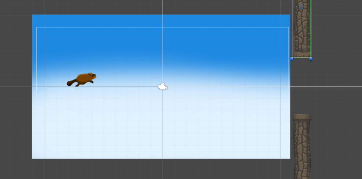
Beavers are cute little critters. Since the game is about flying through the air, I would like it if the character also had those old-timey aviator goggles. It’s very important to maintain readability. It means that the player needs to always be aware of where the character is on the screen and preferably even what the character is. To help with this, I’m going to zoom all the way out so that the whole canvas is just a tiny rectangle (about 5 to 6 inches wide measured on the screen). If I now paint something, I’ll know how it will look like when played on a tiny device. If the result doesn’t resemble beaver, I’d better try again. Note: It’s a very good idea to get a drawing tablet if you’re interested in making more game art. And if you are really serious about becoming a game artist, you need a monitor tablet. This is my personal view on the matter, but my experiences support the statement. First, I found some references on Google image search. These are absolutely necessary so that I have some idea as to what I’m trying to accomplish when making the art On the right side of the screen you’ll see a Layers tab, or docker, as they’re known in Krita. Create a new layer by pressing the plus button on the bottom-left. Now, you’ll be able to paint on top of the background without making any changes to it. In the Brush Presets, next to the Airbrush, there’s a Basic preset. Select that one. Next, place down some circles on the canvas by clicking with the mouse and changing the size of the brush. Try to create a very rough shape of the character. At this point, you’re not yet concerned with details. You just want people to recognize the shape. Move closer and start to close the gaps by carefully painting through them. If you need to erase something, you can get to the Eraser mode by pressing the button at the top of the screen. You get back to painting mode by pressing the button again. Tip: If you want to use the same color as in the picture, hold down Ctrl on keyboard and click the part of the image with that color. This will select it for you. It’s starting to look a bit more like a beaver, but it needs more details. The goggles need the strap and the snout doesn’t look ready, yet. Also, a few references tell me that the tips of the feet need to be thinner and darker. Finally, let’s do some lighting. Create a new layer on top of the beaver layer. Then select both layers, click one of them with second mouse button, select Group and Quick Group. After that, click the little alpha symbol on the top layer. This arrangement makes sure that you can’t draw anything outside the contents of the bottom layer. Now, select the Airbrush preset again and make the size something like 30 px. Make the color white and paint some highlights on top of the beaver. Then switch it to black and paint some shadows on it. Not exactly subtle. At the top of the Layers docker you’ll see a drop-down menu that says Normal. These are blend modes. If you click the drop-down and select Overlay, this will change the highlight a bit. After that, lower the Opacity of the layer down to around 30%. This will soften the shadow on the image. With a bit off fine-tuning and additional details, we have a character we can use in the game. Now, turn off the background layer by pressing the eye icon next to it. Then select the beaver layer group and go to the Image menu and select Trim to current layer. Then save the character as another PNG image. After the save, an undo will return the canvas size back to normal. Use similar techniques to make the obstacle. I’m not going to tell you everything step by step, but I will show you the steps so you’ll have an idea as to how you could proceed. When you’re all done, go back to Unity and import the new images to the project by going to the Assets menu and selecting Import New Assets. Find the files on your drive, select them all, and click Import. Now, select the PlayerCircle and in the Inspector tab, locate the Sprite Renderer component. Underneath it you’ll find a Sprite field. Click the small circle next to it and select the new player image. Do the same thing to the rectangles inside the HoopObstacle. You might have to fine-tune the size of the colliders. In my case, the sprites are way too big for the tiny colliders I had already in the game. This just means that I needed to resize the X and Y of the Box Collider 2D and then scale the objects down. Finally, grab the background image and throw it in the scene. Scale it until it’s big enough to fill the whole view. Then, make sure that the Z position of the background is larger than the other items. This means that it will be further away from the camera. In other words, if you think of the view as a theater stage, this will push the background further away so that it doesn’t hide the other objects underneath it. That’s it. We have art in the game. Congratulations for making it to the end of this lesson. Naturally, working with a drawing tablet is much easier than drawing with a mouse like we did in this lesson. But if you only have your mouse, it doesn’t mean that you can’t make art. It just takes a bit more effort. Just one day left!


If you have feedback or questions drop a note
on Twitter.